RubiRecruit's original Chrome extension asked recruiters to trust an AI-driven evaluation process without ever showing them what the AI was doing. An 8-step flow mixed manual and automated actions with no distinction between them, there was no progress feedback, and the brand's primary colour was overused to the point that nothing signalled priority. Beyond the extension, an Admin Portal and User Portal didn't exist yet - 2 portals built from zero, both designed with no existing pattern to build on.
I redesigned the Chrome extension around a clear 4-step flow with explicit guidance at every stage, then built the Admin and User Portals from the ground up on a single, reusable design system - unifying all 3 surfaces so colour, components, and navigation finally meant the same thing across the entire product.
The result: evaluation time cut by half, zero ambiguity between user and system actions, and two fully-functioning portals delivered where none existed before - on a reusable component foundation built to expand, not rebuild.
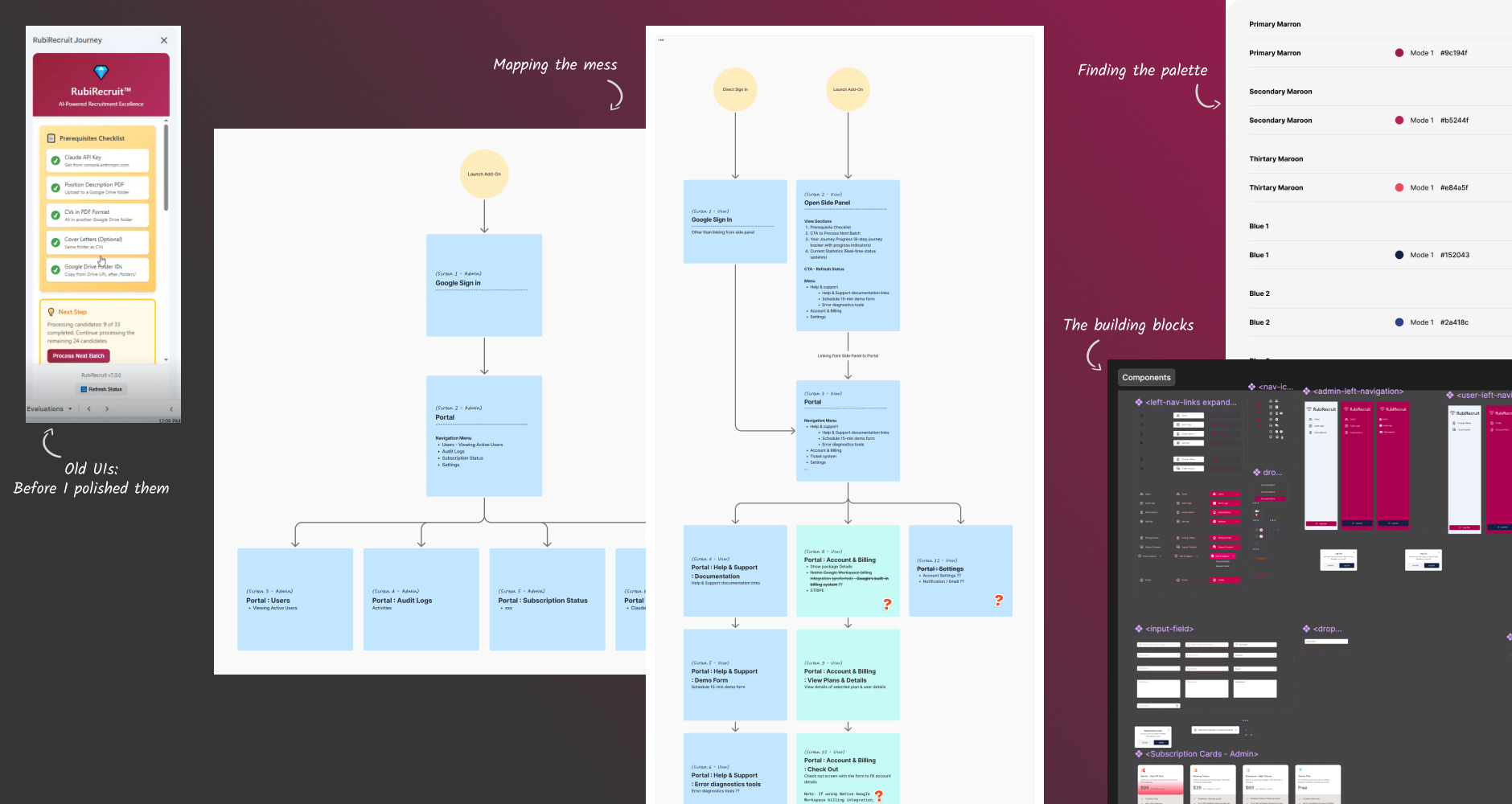
The existing Chrome extension had an 8-step stepper meant to guide recruiters through candidate evaluation, but the steps mixed user actions with AI-automated ones with no distinction between them. Recruiters couldn't tell which steps needed their input and which the system handled on its own.
Beyond the flow itself, the interface worked against clarity at almost every level:
01
No progress feedback.
Users had no sense of what was happening or what came next.
02
Overused primary color.
Rubi's brand color appeared everywhere on screen, so nothing stood out as the actual priority.
03
Missing guidance.
No clear prompts like “upload job description here” or “upload CVs here,” leaving users to guess what each step required.
04
No structural pattern for new surfaces.
The Admin Portal, User Portal, and subscription and payment screens didn't exist yet, meaning features, user journeys, and information architecture had to be defined from scratch, not adapted from something that already worked.
The result was a product that asked users to trust an AI-driven process without ever showing them what the AI was doing, spread across three surfaces with no shared design language to hold them together.
My Role & Responsibility
As the UI/UX Designer, I was responsible for the entire end-to-end design process, including:
Conducting research to understand recruiter requirements, candidate flows, and system expectations
Mapping user journeys and step-based workflows for the Chrome add-on
Creating information architecture for the Admin and User Portals
Designing wireframes, prototypes, and high-fidelity UI for all modules
Building reusable components and setting up a unified design system
Preparing visual guidelines, layout rules, and interaction patterns
Receiving feedback through UX & development team reviews, refining designs based on technical feasibility
The project's design direction, component library, and final interfaces were all created by me, with stakeholder input helping refine decisions.
UX Process
01
Research
Explored the recruitment domain
Identified key tasks performed by recruiters and candidates
Understood constraints and expectations for a Chrome Extension environment
Benchmarked similar tools for workflow optimization
02
Define
Identified recruiter pain points and inefficiencies in traditional evaluation workflows
Created high-level problem statements for each module
Mapped permissions and interactions across Admin, User, and Extension views
03
Ideate
Built task flows and step-based maps for the add-on
Defined IA for Admin navigation (Users, Audit Logs, Subscriptions)
Structured a clean, compact layout for candidate user portal
04
Design
Created low-fidelity wireframes for all screens
Designed a component library (cards, tabs, lists, modals, buttons, progress indicators) for consistent UI
05
Prototype
Designed UIs for both portals
Crafted an elegant and functional UI for the Chrome extension
Built clickable prototypes for testing and developer hand-off
06
Testing
Conducted internal reviews with UX team members
Adjusted visuals, interaction patterns, and states based on dev team feedback
Ensured the final solution balanced usability with technical feasibility
The Solution
The final solution brings together three interconnected digital experiences - a Chrome Add-On, an Admin Portal, and a User Portal - designed to streamline recruitment workflows and make candidate evaluation more efficient and intuitive.
Chrome Add-On
From 8 Confusing Steps to 4 Clear Ones
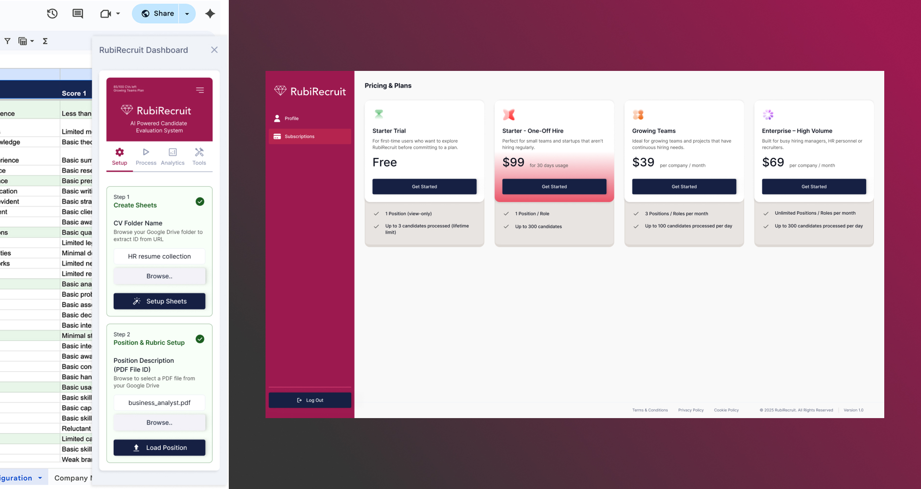
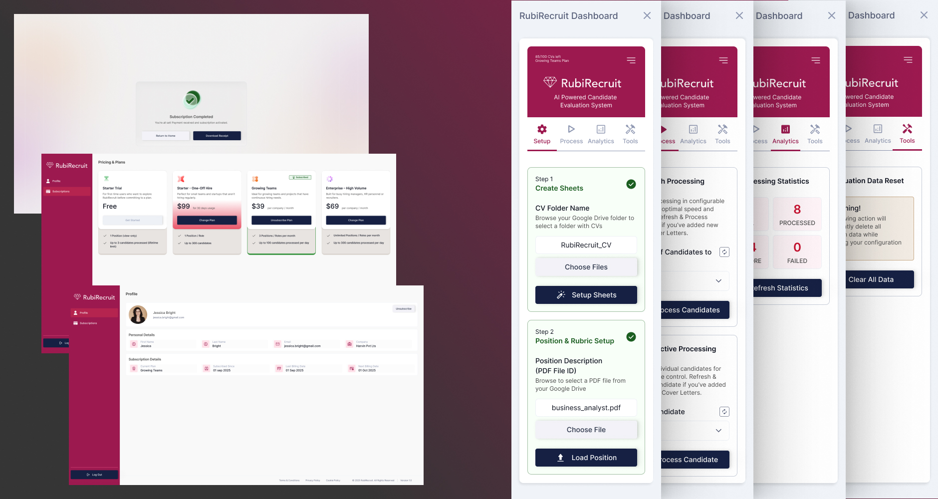
The original 8-step flow mixed user actions with AI-automated steps, leaving recruiters unsure what needed their input. I stripped out the automated steps entirely and rebuilt the flow around only what recruiters actually need to do, cutting it to 4 steps. Each step now includes a clear progress indicator, contextual input fields, and explicit guidance, “upload job description here,” “upload CVs here,” so recruiters always know what's expected without guessing. Candidate information can be extracted and processed directly from the browser, with no tool-switching required.
Admin Portal
Built from Zero into Clear Role-Based Management
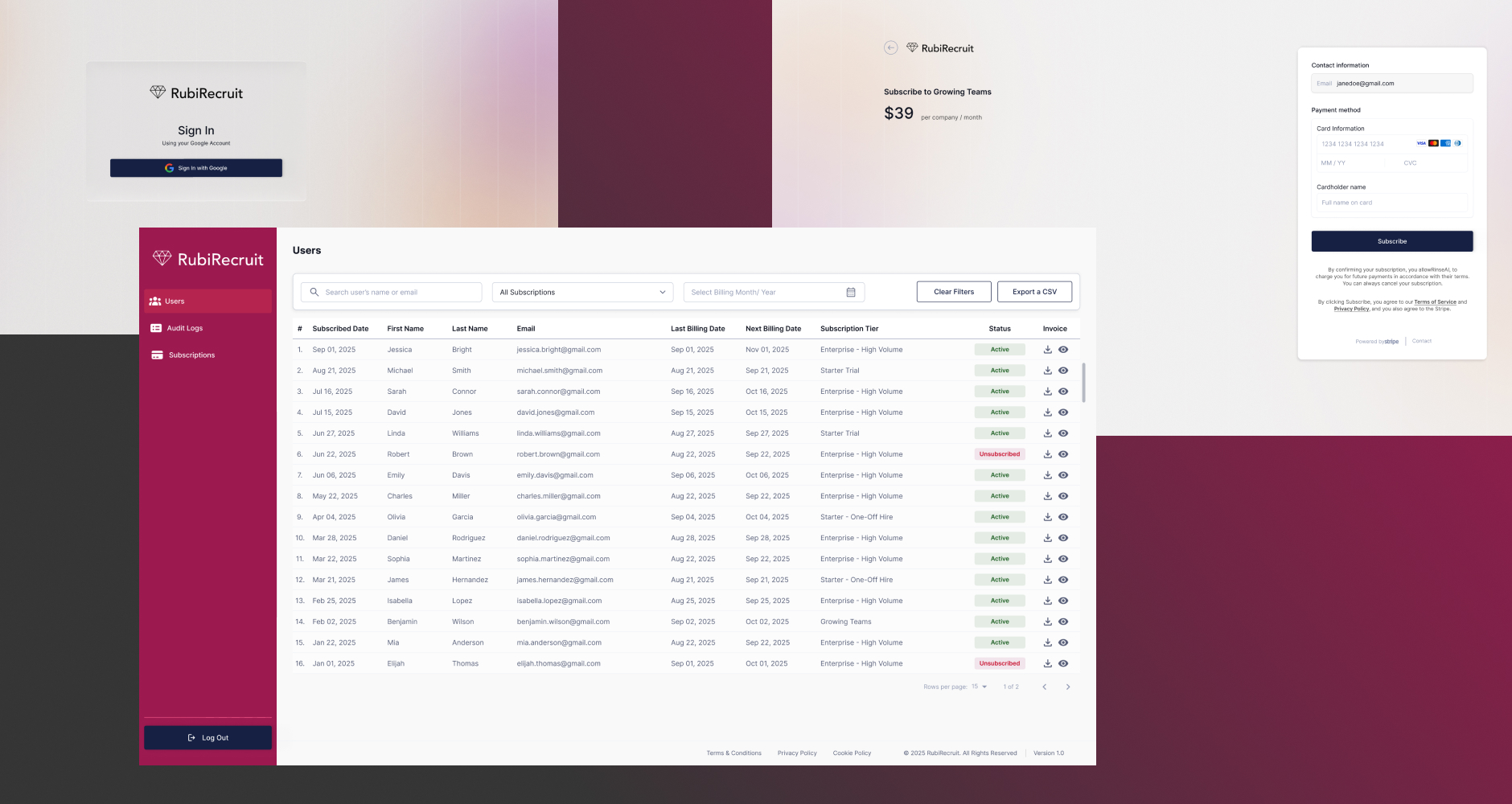
The Admin Portal didn't exist before this project, so every feature, journey, and structure had to be defined from scratch. I designed a modular layout giving administrators direct access to Users, Audit Logs, and Subscription settings, with a navigation structure clear enough that no onboarding is needed to find what you're looking for. The result replaces what would have been an undefined, ad hoc system with transparent, predictable administrative control.
User Portal
Simple by Design, Not by Accident
Also built from scratch, the User Portal was designed around one goal: candidates should never have to think about how to use it. Profile and subscription management are laid out with minimal friction and high readability, so the portal supports the candidate experience instead of adding to its complexity.
Unified Visual Language
Fixing the Colour Confusion
The original extension overused Rubi's primary colour across nearly every element, so nothing signalled importance. I established a consistent design system, components, spacing, typography, colour usage, and interaction patterns, applied across all three surfaces. Colour now carries meaning again: it highlights what matters instead of competing with everything else on screen. This shared language also closes the gap between the Chrome extension, Admin Portal, and User Portal, so switching between them no longer feels like switching products.
Scalable, Flexible Architecture
Foundation that absorbs future features
Because the Admin and User Portals were new territory with no existing pattern to follow, I built every component to be reusable from the start rather than designing one-off screens. This gives the team a foundation that absorbs future features and integrations without rework, and lets designers and developers extend the system consistently as it grows.
Design Highlights
Step-Based Structured Workflow
Clean, guided steps inside the Chrome add-on make complex evaluation tasks feel simple and linear.
Consistent components, spacing, typography, and colors across all platforms.
Efficient Layouts
Screens designed for focus, reducing clutter and decision fatigue.
Scalable UI Components
Ensures quick future enhancements and easy development handoff.
Responsive & Accessible Design
Readable layouts, balanced spacing, and accessible color contrasts.
Outcome & Impact
Evaluation Time Cut by Half
Reducing the workflow from 8 steps to 4 didn't just shorten the flow, it removed the guesswork. Recruiters now move through candidate evaluation without pausing to figure out what needs their input, cutting the time and mental effort spent per candidate.
Zero Ambiguity Between User and System Actions
By separating AI-automated steps from user actions entirely, recruiters always know what they're responsible for and what the system has already handled, closing the trust gap that came from a flow with no distinction between the two.
Two Portals Built Where None Existed
The Admin and User Portals didn't exist before this project. Delivering both from scratch, with defined features, journeys, and navigation, gave the product a management and self-service layer it previously had no way to offer.
A Colour System That Means Something Again
Replacing the overused primary colour with a deliberate, restrained palette means visual weight now signals actual priority. Users can tell what matters on a screen at a glance, instead of everything competing for attention equally.
One Design Language Across Three Surfaces
Before this project, the Chrome extension, Admin Portal, and User Portal had no shared visual or interaction pattern. A unified component system now means switching between them feels like using one product, not three.
A Foundation Built to Expand, Not Rebuild
Every component was built reusable from day one. New features and integrations can now be added by extending existing patterns rather than starting over, reducing rework for the design and development team going forward.
Learnings
Learned to design AI actions users can trust
Designing for AI-driven products requires balancing automation clarity with user trust - every AI action needs a legible rationale in the UI
Developed rigour in edge-case and error-state thinking
Stepped workflows (like the Chrome add-on) demand meticulous edge-case thinking: empty states, error flows, and partial completions are as critical as the happy path
Learned the value of documenting design system decisions
Building a design system from scratch taught me the value of decision documentation - naming conventions, token structures, and usage rules prevent costly inconsistencies later
Gained understanding of progressive disclosure in complex tools
Working with complex admin portals revealed the importance of progressive disclosure: exposing advanced features only when relevant reduces cognitive overload
Improved early collaboration with developers
Frequent developer syncs early in the process saved significant rework - technical constraints are design constraints and should be surfaced in ideation, not handoff