Increase in Lead Conversion
40%
Visitors who once had no clear path to action now move through a mapped journey built to convert, raising lead conversion by 40% compared to the previous site versions.
Swivel's marketing websites weren't generating the engagement or lead conversions the business needed, and the issues went deeper than visual polish. Four disconnected brand sites - Swivel Tech, Swivel Finance, and the wider group - had incomplete navigation, outdated UI patterns, and no unified brand system, so visitors moving between entities encountered a different experience each time and the path from landing on a page to taking action was undefined.
I rebuilt the navigation around a complete service architecture, redesigned the visual language to signal Swivel's AI-forward positioning, and mapped clear user journeys from landing to action. Working closely with the Lead UX Designer, marketing team, and co-founders, I established one unified design system across all four brand sites, then delivered fully responsive experiences across desktop, tablet, and mobile.
The result: a 40% increase in lead conversion, workflow friction cut by 30% through AI-powered features embedded directly into the site experience, and 4x stronger brand consistency - replacing four inconsistent sites with one coherent system that finally reflected the quality of the work Swivel actually delivered.
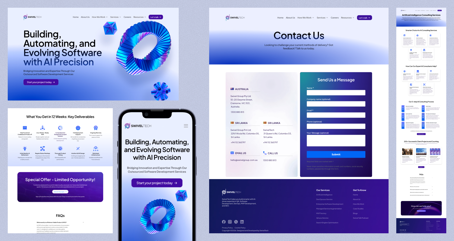
Swivel's marketing websites weren't generating the engagement or lead conversions the business needed, and the underlying issues went deeper than visual polish.
Fragmented service architecture.
Navigation structures were incomplete, many of the services offered by Swivel Tech and Swivel Finance had no clear place in the site structure, leaving visitors unable to find or understand the full range of what the company offered.
Outdated visual language.
The sites used old-styled UI patterns that undersold the business. Stakeholders wanted the design itself to signal that Swivel was building with AI, a defining technology of the moment, but nothing on screen communicated that.
Unclear user journeys.
Pages didn't guide visitors toward action. The path from landing on a site to understanding Swivel's value proposition to taking the next step was undefined.
No unified brand system.
Multiple brand websites existed with inconsistent colours, typography, and messaging, so the same visitor moving between Swivel entities encountered a different experience each time.
The result was a set of websites that failed to reflect the quality of the work Swivel actually delivered, and gave stakeholders no way to present the company as the modern, AI-forward organization it was becoming.
Working closely with the Lead UX Designer, I contributed across the full design process:
Collaborated with the Lead UX Designer throughout the end-to-end design process
Designed responsive web, tablet, and mobile experiences
Created multiple design explorations and compared alternative solutions to identify the most effective direction
Built interactive prototypes for stakeholder reviews and usability validation
Worked closely with developers and QA teams to ensure smooth implementation and design consistency
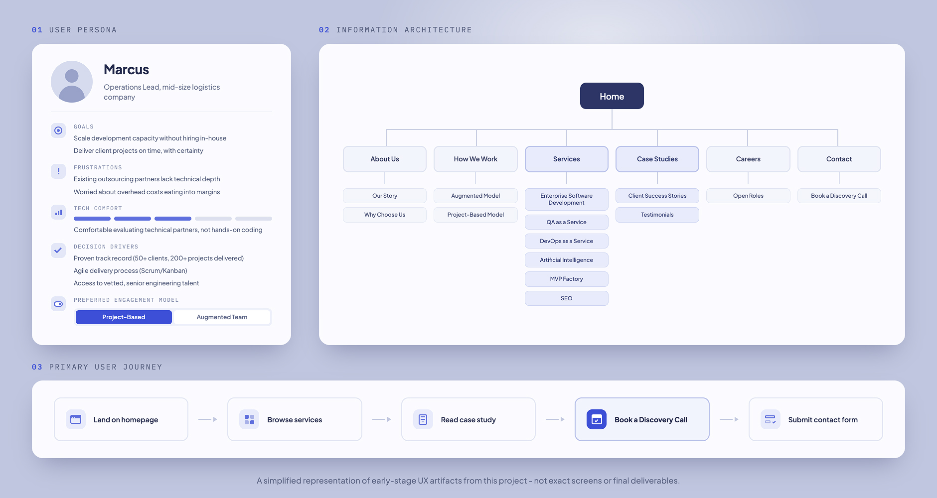
Rebuilt navigation around a complete service architecture.
Restructured the site map so every Swivel Tech and Swivel Finance service had a clear, findable place, replacing incomplete navigation with a structure visitors could actually use to understand the full range of what the company offered.
Redesigned the visual language to signal AI-forward positioning.
Replaced outdated UI patterns with a modern interface that gave stakeholders what they'd been missing, a design that visually communicated Swivel was building with AI, not just claiming to.
Mapped clear user journeys from landing to action.
Restructured page flow and content hierarchy so every page guided visitors toward a defined next step, turning an undefined path into a deliberate one that supported lead generation and contact conversion.
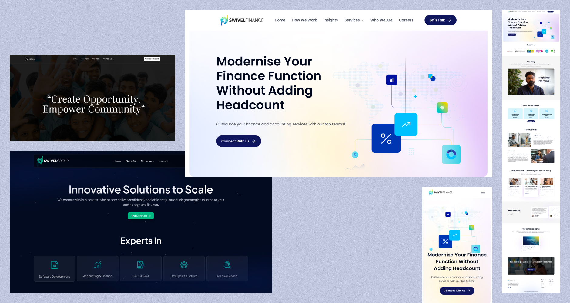
Established one unified design system across all four brand sites.
Introduced consistent colours, typography, and messaging across Swivel Tech, Swivel Finance, and the wider group ecosystem, so a visitor moving between entities now experiences one coherent brand instead of four disconnected ones.
Delivered fully responsive experiences
Delivered fully responsive experiences across desktop, tablet, and mobile, ensuring the new navigation, visual language, and user journeys held up consistently regardless of device.
Increase in Lead Conversion
40%
Visitors who once had no clear path to action now move through a mapped journey built to convert, raising lead conversion by 40% compared to the previous site versions.
Unified Experience Across Every Company Touchpoint
Replacing four disconnected sites with one design system means visitors moving between Swivel entities now experience a single coherent brand, closing a gap that previously undermined trust at scale.
Faster Workflows Through AI-Powered Features
30%
Embedding AI-powered capabilities directly into the site experience cut workflow friction by 30%, turning a previously static set of marketing pages into something functionally useful, not just visually improved.
Stronger Brand Consistency Across Business Units
4x
What was once four sites with inconsistent colours, typography, and messaging is now one unified system, quadrupling brand consistency across Swivel Tech, Swivel Finance, and the wider group.
Learned to align quickly while keeping a distinct perspective
Collaborating alongside a Lead Designer sharpened my ability to align on design direction quickly while still contributing distinct creative perspectives
Strengthened skills in flexible multi-brand component systems
Designing across multiple sub-brands within one system reinforced the importance of flexible component libraries that maintain consistency without limiting expression
Improved how I present design rationale to stakeholders
Stakeholder prototype reviews taught me to present design rationale alongside visuals - decisions land better when the thinking behind them is made explicit
Learned that design-dev alignment is continuous, not a handoff
Working with QA teams highlighted how small implementation gaps can erode the designed experience, making design-dev alignment a continuous process rather than a one-time handoff